
In the run-up to the celebrations of the bicentenary of the birth of Florence Nightingale on the 12th of May, we invite you to take part in our data visualisation competition.
As well as for her pioneering work in nursing, Florence will be always associated to the polar area diagram of Crimean War deaths also known as the Coxcomb or rose chart. As described by Alison Hedley in her Significance article on Victorian visualisation, “the polar area graph was among many visualisations that Nightingale used to highlight the relationship between mortality and sanitation that she perceived based on both her first-hand experience as a nurse and the medical data gathered at war hospitals.”
But nearly 200 years later… can you do better than Florence? We challenge you to create a fun, interesting, and creative way to present the same data.
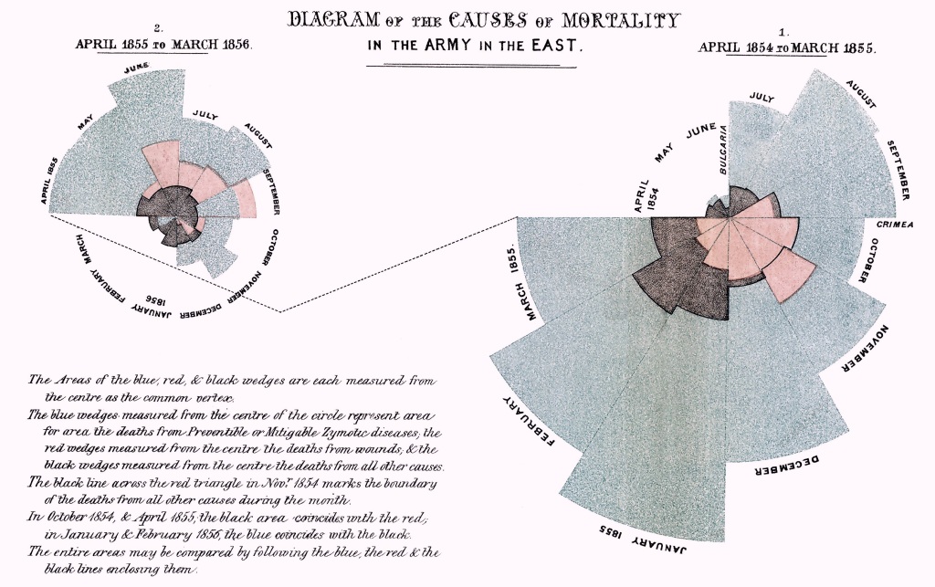
Source: Wikimedia commons
We welcome entries using any software or media from both adults and children.
You can download the data Florence used below (source: Understanding Uncertainty):
(also available in the R package HistData)
The data corresponds to estimated average monthly strength of the Army; and the deaths and Annual Rate of Mortality (AMR) per 1000 in each month, from April 1854 to March 1856 (inclusive), in the Hospitals of the Army in the East.
Age appropriate data
There are several online generators (e.g., LiveGap or IASTE research group) that will allow younger kids to input their own data and create coxcombs.
In R you can generate a simple polar diagram with your own toy data using the following code (Source: Carolyn Parkinson):
require(ggplot2)
# function to compute standard error of mean
se <- function(x) sqrt(var(x)/length(x))

# set seed for reproducible results
set.seed(9876)

# create toy data
DF <- data.frame(variable = as.factor(1:12),
                 value = sample(12, replace = TRUE))
DF

# create bar plot
plot <- ggplot(DF, aes(variable, value, fill = variable)) +
  geom_bar(width = 1, stat = "identity", color = "white") +
  geom_errorbar(aes(ymin = value - se(DF$value),
                    ymax = value + se(DF$value),
                    color = variable),
                    width = .2) +
  scale_y_continuous(breaks = 0:nlevels(DF$variable)) +
  theme_gray() +
  theme(axis.ticks = element_blank(),
        axis.text = element_blank(),
        axis.title = element_blank(),
        axis.line = element_blank())
plot
# create polar area diagram
plot + coord_polar()
How to enter
You can send your entries to our email statsyss@gmail.com or tweet us @statsyss using the hashtag #FloViz
Please note that we will share the entries on our Social Media and Website.
Closing date
Deadline for submissions is midnight (GMT+1) of the 10th May 2020.
Prizes
We will pick winning entries from 3 adults and 3 children, and they will receive one of these #Nightingale2020 badges designed by Heidi Gardner (Science on a Postcard). Winners will be announced at noon (GMT+1) of the 12th May 2020.

designed by Science on a postcard.

