The YSS is one of the Sections of the Royal Statistical Society

Latest Posts
-
New YSS Website
This website is no longer in use. To keep up to date with our news and upcoming events, please visit our new website at: https://rss.org.uk/membership/rss-groups-and-committees/sections/young-statisticians/…
-
Wikipedia edit-a-thon: Women and Underrepresented minorities in Statistics & Data Science
Date: 27th of November, 3-5 pm (GMT) Registration: https://rss.org.uk/training-events/events/events-2020/sections/wikipedia-edit-a-thon-women-and-underrepresented-m/ This event aims to fill the gaps in Wikipedia pages dedicated to women and underrepresented minorities…
-
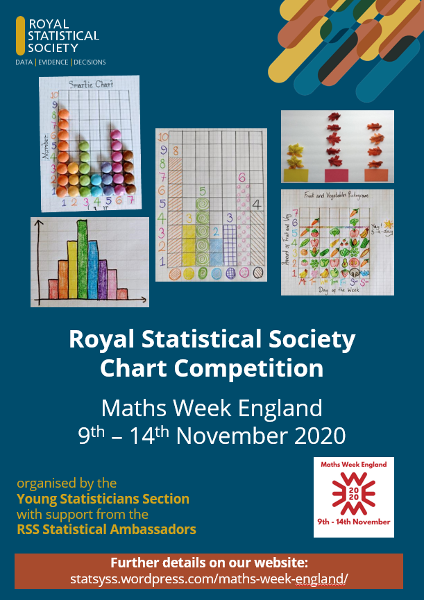
Chart Competition Winner!
We’re excited to announce the winner of the Royal Statistical Society’s Maths Week England 2020 primary school chart competition is… Lola Korn (aged 10)! Congratulations…
-

Check out our Chart Competition for Maths Week England 2020
To celebrate Maths Week England 2020, the Royal Statistical Society is running a chart competition for primary school aged children.The competition is free to enter and will close…
New YSS Website
This website is no longer in use.
To keep up to date with our news and upcoming events, please visit our new website at: https://rss.org.uk/membership/rss-groups-and-committees/sections/young-statisticians/
Thank you for your continuing support of the Young Statisticians Section!
Wikipedia edit-a-thon: Women and Underrepresented minorities in Statistics & Data Science
Date: 27th of November, 3-5 pm (GMT)
Registration: https://rss.org.uk/training-events/events/events-2020/sections/wikipedia-edit-a-thon-women-and-underrepresented-m/
This event aims to fill the gaps in Wikipedia pages dedicated to women and underrepresented minorities in statistics and data science.

All welcome! No experience is required but this event is limited to 30 participants to ensure active engagement in the editing process.
Timetable:
3-3:10 Intro to the Wikipedia edit-a-thon
3:10-3:30 Invited talk. Hillary Juma (Data Science Campus, ONS BAME network)
3:30-4:00 Practical information
4:00-5:00 Editing time!
Even if you cannot attend the event, we intend to continue this work as a living project for further improvement of Wikipedia profiles that are either missing or not well described, and would be very grateful for your input.
Please send us your suggestions: https://forms.gle/FospZ3sJwEVMG54y5
Chart Competition Winner!
We’re excited to announce the winner of the Royal Statistical Society’s Maths Week England 2020 primary school chart competition is…
Lola Korn (aged 10)!


Congratulations Lola for your awesome 3D graph showing the number of steps taken and amount of time exercised each day.
Our judges thought the graph was amazingly crafted, well labelled, and an incredibly creative way to depict multiple variables and data types.
Lola has won a copy of “Great Graphs and Sensational Statistics: Games and Activities That Make Math Easy and Fun” by Lynette Long.
Other notable entries include:
This detailed scatter plot by Tara (aged 10), which clearly displays the length and width of lots of leaves and incorporates a brilliant background which adds to the users understanding of the data.

And this fabulous homemade pie chart baked by Elise (aged 9), which shows favourite flavours of jam.

The chart competition was organised for Maths Week England by the Young Statisticians Section of the Royal Statistical Society, with support from the RSS Statistical Ambassadors.
Check out our Chart Competition for Maths Week England 2020
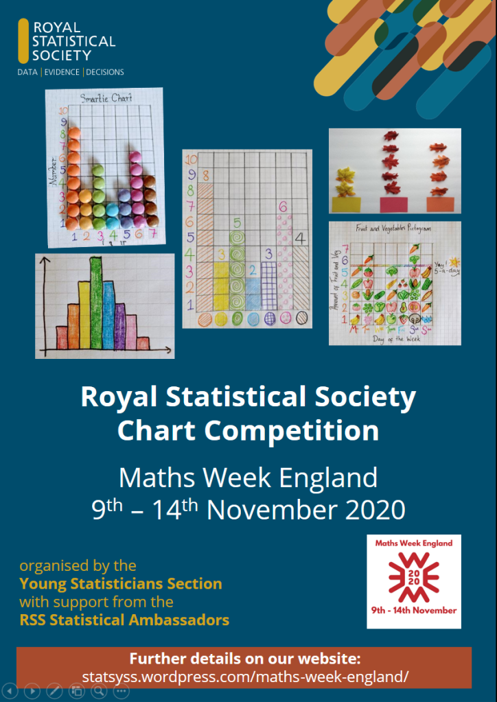
To celebrate Maths Week England 2020, the Royal Statistical Society is running a chart competition for primary school aged children.
The competition is free to enter and will close at 12:00 (GMT) on Friday 13th November 2020.
How to take part:
Create a chart about something that is important to you using data that you have collected.
- Collect data about something that is important to you; your favourite sweets, the temperature in your garden, your family’s heights…
- Create a chart (pictogram, bar chart, line graph, scatter plot…) using the data you have collected.
- Send a photo of your chart, along with your first name and age, to statsyss@gmail.com before 12:00 (GMT) on Friday 13th November 2020.
Our favourite charts will be published on our website and shared on Twitter.
The winning chart will be awarded a prize.
To help get you started we’ve provided a student leaflet containing instructions to create a Smartie chart.
Click here for further details and the competition terms and conditions.
Nightingale2020 badge
The Young Statisticians Section commissioned this beautiful badge to celebrate Florence Nightingale’s birth bicentenary, with the support and funding of the Royal Statistical Society Nightingale2020 planning group.
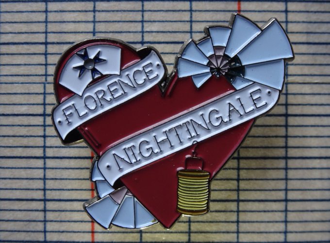
Born in 12 May 1820, Florence Nightingale was the first female member of the RSS in 1858. She remained a member until her death over 50 years later.
The badge includes the following features:
- Nightingale badge cross, a symbol of nursing excellence: https://thenightingalefellowship.org.uk/about-us/
- Polar area diagrams from her report on Crimean War mortality and the impact of sanitation (Notes on Matters Affecting the Health, Efficiency, and Hospital Administration of the British Army’): https://www.florence-nightingale.co.uk/coxcomb-diagram-1858/
- Turkish ‘fanoos’ lamp carried by Florence Nightingale during the Crimean war: https://www.florence-nightingale.co.uk/fanoos/
The badge will be awarded to the winners of several events during the year, including our #FloViz data visualisation competition, the Young Researchers using Statistics Symposium organised by the Royal Statistical Society Highlands and Islands Local Group and the Royal Statistical Society international conference.
Altea Lorenzo-Arribas, 12th July 2020
#FloViz winners

Most creative
Bubbleplot in Jupyter, by Roddy Jaques
Most innovative
Animated coxcomb in R, by Sian Bladon
Most accurate
Coxcomb reproduction in R, Edward Gunning
Children category
Nandita Das for her beautiful version of the diagram in the shape of Athena, Flo’s pet owl
Eider Díaz de Argandoña for her impressive plots and website analysing Nightingale’s data

Entries were judged by David Green (director of the Florence Nightingale museum), Lucy Teece (YSS chair, University of Leicester), Craig Anderson (YSS meetings secretary, University of Glasgow). Liz Buckingham-Jeffery (YSS & RSS Nightingale2020 Planning group, Highways England) & Altea Lorenzo-Arribas (YSS & RSS Nightingale2020 Planning group, BioSS).
#FloViz challenge entries
Florence Nightingale’s famour polar area or rose diagram (also known as coxcomb) has been well studied through history. We asked our followers to create their interpretation of these popular plots in any media or software they wished and these are the fantastic results from the #FloViz challenge.
We would like to highlight the collaborative spirit and discussion that has been created by the participants during the past 9 days, where code has been provided, feedback has been shared and mutual support has been shown. Please check the hashtag #FloViz to follow these fascinating #dataviz conversations.
Adult entries
In order of submission the adult entries to the challenge are:
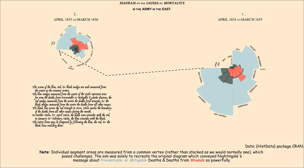
1
Reproduction of the coxcombs in R, by Edward Gunning (University of Limerick)
Code and additional info: https://github.com/edwardgunning/FlorenceNightingale
2
Reproduction of second set of coxcombs representing Manchester mortality in R, by Edward Gunning (University of Limerick)
Code and additional info: https://github.com/edwardgunning/FlorenceNightingale
Edward has summarised his two entries in the form of an infographic:
3
Animated coxcomb showing overlapping sectors in R, by Dan Miller
4
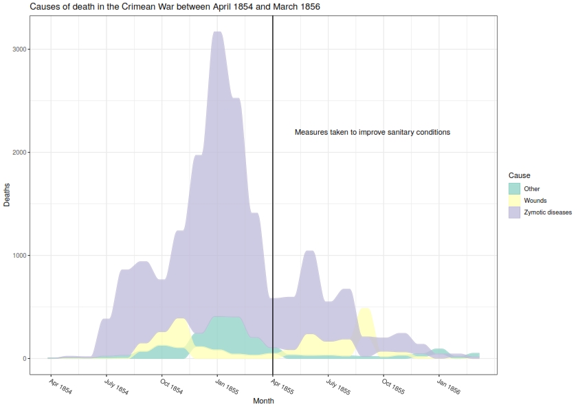
Stacked bar chart showing mortality by cause for British soldiers in the Crimean War in R, by Will Ball (Edinburgh Napier University)
Code: https://github.com/will-ball/FloViz
5
Facetted bar chart in R by Will Ball (Edinburgh Napier University)
Code: https://github.com/will-ball/FloViz
6
Facetted bar chart with free scales in R, by David Henderson (Edinburgh Napier University)
Code: https://github.com/davidhen/floviz/blob/master/floviz.md
7
Simplified bar chart version in R, by David Henderson (Edinburgh Napier University)
Code: https://github.com/davidhen/floviz/blob/master/floviz.md
8
Animated visualisation of the annual rate of deaths attributed to preventable infection in R, by Sian Bladon (University of Manchester).
9
Animated comparison of monthly mortality rate over time by cause of dealth and estimated army size in R, by Graham Wheeler (University College London).
Code: https://github.com/graham-wheeler/FloViz
10
Area plot of deaths by causes, by James Jackson
11
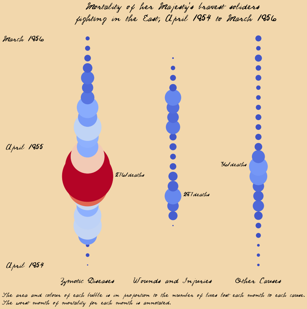
Mortality bubbleplot in Jupyter, by Roddy Jaques
Code: https://github.com/RoddyJaques/RSSFlorenceNightingaleComp
Children entries
In order of submission the children entries to the challenge are:
1
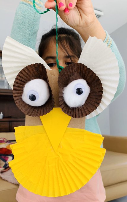
Beautiful Florence’s pet owl Athena made with coxcomb-like shapes, by Nandita Das.
2
Impressive plots and website, by Eider Díaz de Argandoña.
We’ll announce the winners of the prizes tomorrow 12th May 2020 at noon (GMT+1).
The three winning prizes in each category will win one of these amazing badges designed by Heidi Gardner (Science on a Postcard).

Just for fun
In order to get the challenge started, we produced some fun reinterpretations, see below!
We even got our own hex sticker! Thanks to Edward Gunning for coding this!
Let’s continue celebrating Florence Nightingale pioneering work by keeping the hashtag #FloViz alive. Please continue tweeting your visualisations and we’ll circulate them. Who knows, there might even be some sparee badges 😉
Florence Nightingale #dataviz competition (for children and adults!)
In the run-up to the celebrations of the bicentenary of the birth of Florence Nightingale on the 12th of May, we invite you to take part in our data visualisation competition.
As well as for her pioneering work in nursing, Florence will be always associated to the polar area diagram of Crimean War deaths also known as the Coxcomb or rose chart. As described by Alison Hedley in her Significance article on Victorian visualisation, “the polar area graph was among many visualisations that Nightingale used to highlight the relationship between mortality and sanitation that she perceived based on both her first-hand experience as a nurse and the medical data gathered at war hospitals.”
But nearly 200 years later… can you do better than Florence? We challenge you to create a fun, interesting, and creative way to present the same data.
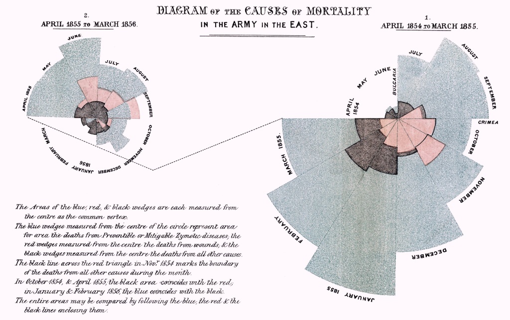
Source: Wikimedia commons
We welcome entries using any software or media from both adults and children.
You can download the data Florence used below (source: Understanding Uncertainty):
(also available in the R package HistData)
The data corresponds to estimated average monthly strength of the Army; and the deaths and Annual Rate of Mortality (AMR) per 1000 in each month, from April 1854 to March 1856 (inclusive), in the Hospitals of the Army in the East.
Age appropriate data
There are several online generators (e.g., LiveGap or IASTE research group) that will allow younger kids to input their own data and create coxcombs.
In R you can generate a simple polar diagram with your own toy data using the following code (Source: Carolyn Parkinson):
require(ggplot2)
# function to compute standard error of mean
se <- function(x) sqrt(var(x)/length(x))

# set seed for reproducible results
set.seed(9876)

# create toy data
DF <- data.frame(variable = as.factor(1:12),
                 value = sample(12, replace = TRUE))
DF

# create bar plot
plot <- ggplot(DF, aes(variable, value, fill = variable)) +
  geom_bar(width = 1, stat = "identity", color = "white") +
  geom_errorbar(aes(ymin = value - se(DF$value),
                    ymax = value + se(DF$value),
                    color = variable),
                    width = .2) +
  scale_y_continuous(breaks = 0:nlevels(DF$variable)) +
  theme_gray() +
  theme(axis.ticks = element_blank(),
        axis.text = element_blank(),
        axis.title = element_blank(),
        axis.line = element_blank())
plot
# create polar area diagram
plot + coord_polar()
How to enter
You can send your entries to our email statsyss@gmail.com or tweet us @statsyss using the hashtag #FloViz
Please note that we will share the entries on our Social Media and Website.
Closing date
Deadline for submissions is midnight (GMT+1) of the 10th May 2020.
Prizes
We will pick winning entries from 3 adults and 3 children, and they will receive one of these #Nightingale2020 badges designed by Heidi Gardner (Science on a Postcard). Winners will be announced at noon (GMT+1) of the 12th May 2020.
designed by Science on a postcard.
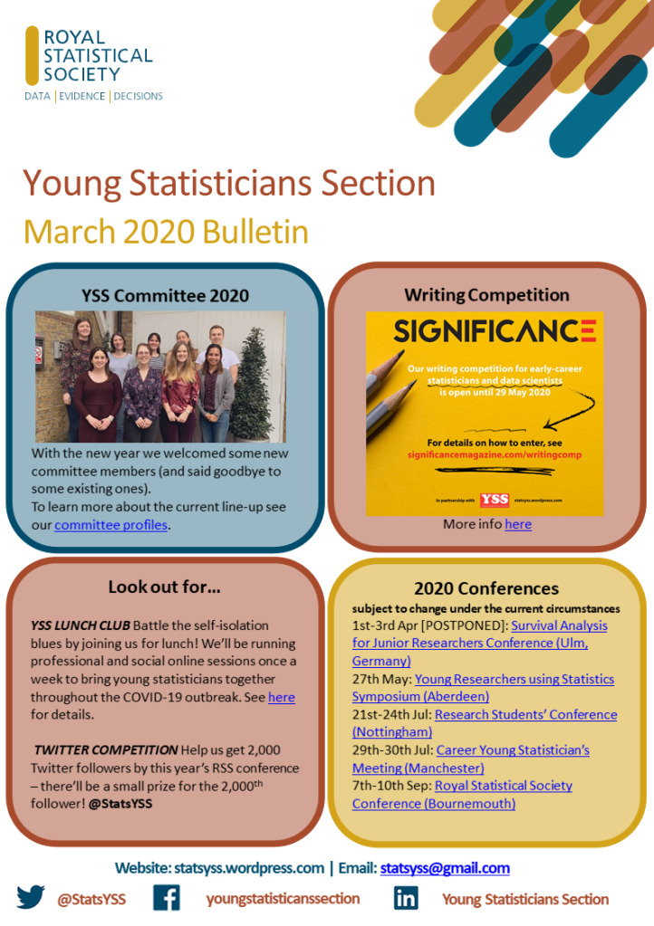
First YSS bulletin of 2020!
Hot off the press we have our 2020 March Bulletin, showcasing upcoming activities for young statisticians.
Make sure to follow @statsyss on Twitter to keep up to date with our lockdown lunch club!
YSS Lunch Club
The YSS are aware that, due to the current COVID-19 outbreak, many are having to self-isolate or work from home. This could result in many young statisticians feeling isolated or lonely. We have put together the YSS Lunch Club to try to help!
The YSS Lunch Club will consist of online meetings which run from 12:00 (GMT) on Wednesday lunch times for half an hour. Meetings will alternate between discussions of a range of statistical and professional development topics and a pub quiz, both in an informal setting with plenty of time to chat.
Links for upcoming YSS Lunch Clubs are below.
If you have any suggestions for light-hearted topics that we could discuss during our meetings then please send us an email: statsyss@gmail.com.

Wednesday 8th April: Quiz
Join us in #YSSLunchClub for our third general knowledge Quiz!
A jovial, pub quiz style session just for fun.
📅 Wednesday 8th April
⏰ 12:00 BST (GMT+1)
💻 Zoom Link: https://tinyurl.com/ysslunch6
🗝️ Password: 080420
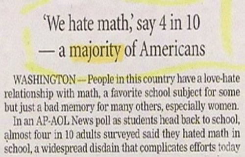
Wednesday 1st April: Bad News
No news is good news, but some headlines are splendidly inaccurate!
Join us for #YSSLunchClub where this week we’ll be reviewing the headlines that might make you cringe, recoil, or gasp with horror.
📅 Wednesday 1st April
⏰ 12:00 BST (GMT+1)
💻 Zoom Link: https://us04web.zoom.us/j/930116497

Friday 27th March: Friday Quiz
Join us in #YSSLunchClub for our second Friday Quiz!
A jovial, general knowledge, pub quiz style session to end the week.
📅 Friday 27th March
⏰ 12:00 GMT
💻 Zoom Link: https://us04web.zoom.us/j/141820943
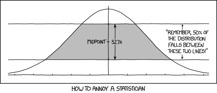
Wednesday 25th March: xkcd comics
This lunch club is for anyone who enjoys a sarcasm, statistics, and comics. We’ve trawled through xkcd.com and dug out our favourite statistical comics by Randall Monroe to share with you.
Join us for our third #YSSLunchClub, to admire and enjoy some fantastic short comics and chat with other isolated statisticians.
📅 Wednesday 25th March
⏰ 12:00 GMT
💻 Zoom Link: https://us04web.zoom.us/j/308222670
Friday 20th March: Friday Quiz
Join us in #YSSLunchClub for our first Friday Quiz!
A jovial, general knowledge, pub quiz style session to end the week.
📅 Friday 20th March
⏰ 12:00 GMT
💻 Zoom Link: https://us04web.zoom.us/j/606330572
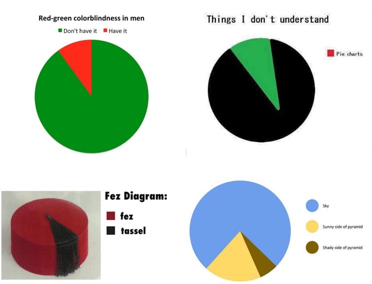
Wednesday 18th March: Bad Graphs
As statisticians we can spend a lot of time editing and adjusting our graphs to make them perfect, but we rarely get to spend any time admiring the bad graphs!
Join us for our first #YSSLunchClub, during which we will admire, ponder, discuss, and pontificate an array of imperfect, careless, and downright gruesome graphs.
📅 Wednesday 18th March
⏰ 12:00 GMT
💻 Zoom Link: https://us04web.zoom.us/j/310944223
